Wow, I cannot believe that it has already been six years since Omake Theater received its first facelift. The Internet and how we use it has changed drastically in that time. Back when I created the original redesign, my focus for mobile was just to make sure the site displayed correctly on it. This time around, my primary objective with the redesign was to make sure the website was firstmost optimized for mobile usability and speed with a secondary focus on individual branding for each title.
Making the Site Mobile Friendly
Omake Theater's website uses responsive design. This means that the layout of the webpages will adjust accordingly, depending on the screen resolution of the device it is being viewed on. To be honest, it has been this way since the initial redesign. A major difference between what it was and what it is now is that any code, design elements or content that are not part of the mobile experience are not loaded on mobile devices. This helps to drastically lowered the weight of the pages and, in turn, decrease the load time.My other hurdle to overcome was how to improve the overall user experience when viewing the website on mobile devices. Personally, I prefer to do my browsing on desktop machines, but that is just me. So, when it came to this task, I approached it with the mindset that I wanted to create something that compelled people like me to want to use the mobile version. To be completely honest, while I do enjoy all the extra bells and whistles that come with the desktop version, I think I now prefer to view the site on my smartphone. #MissionAccomplished
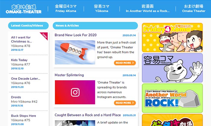 Home, News & Articles (redesign)
Home, News & Articles
From a design point-of-view, I wanted each of the site's brands (i.e. Friday 4Koma, Yōikoma, etc…) to have their own unique look and feel. Before this update, every channel was merely a palette swap of the Friday 4Koma template, and the home page/news section was no exception. I felt the look of main hub needed to differentiate it from the rest of the site. This is what I designed.
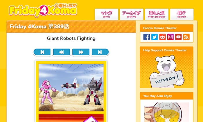 Friday 4Koma (redesign)
Friday 4Koma
With Friday 4Koma, I didn't change what wasn't broken, but did fix what was. At first glance, the design looks nearly identical to the previous version, but looks can be deceiving, especially when it comes to smartphone devices.
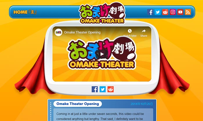 Omake Theater (redesign)
Omake Theater
For Omake Theater, on the other hand, I actually rolled the clocks back to when the site originally launched. Its colors, look and styles are based on the Omake Theater circa 2009 only with all the modern animations and flair that I wanted to include when I originally envisioned the site.
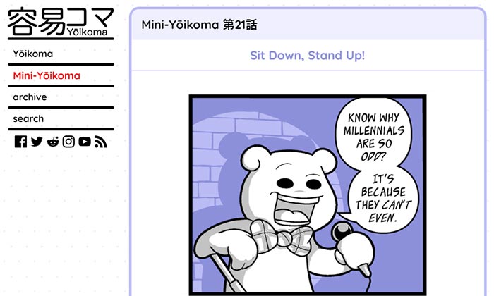 Yōikoma/Mini-Yōikoma (redesign)
Yōikoma
Yōikoma and Mini-Yōikoma are now combined under one roof. I always intended these series to be two sides of the same coin. I plan to collect both brands together in the same volume when I inevitably send them to press.
Yōikoma means 'simple frames'. That meaning compelled me to give its brand a clean simple design that also compliments the color palettes of each of its individual comics.
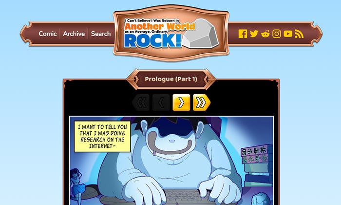 In Another World as a Rock… (redesign)
In Another World as a Rock…
Lastly, but not leastly, is I Can't Believe I Was Reborn in Another World as an Average, Ordinary Rock! Contrary to what you may read on the Internet, the series is not dead. It is merely on hiatus. I hope you enjoy its fantasy inspired design of which more fantastical wonderments are yet to be added.
So, that's it!
I can honestly say that I am pleased with how the site's redesign turned out. Heads up, I still have some minor changes and additional content/features to add to it in the coming weeks, but nothing major like I have been doing.
And now to get back to making comics…