Earlier this week, I came across the original version of the very first Yōikoma. I thought to myself how different the series could have looked if I had continued with this original art direction. Then, I realized that every comic I created for Omake Theater has had its art direction changed in some way or another.
Day One Patches are the Norm
Now, when I say art directions were changed, I don't mean during the initial creative process. In fact, for every series except for Yōikoma, the look and feel of the comics were changed after their series had actually launched.
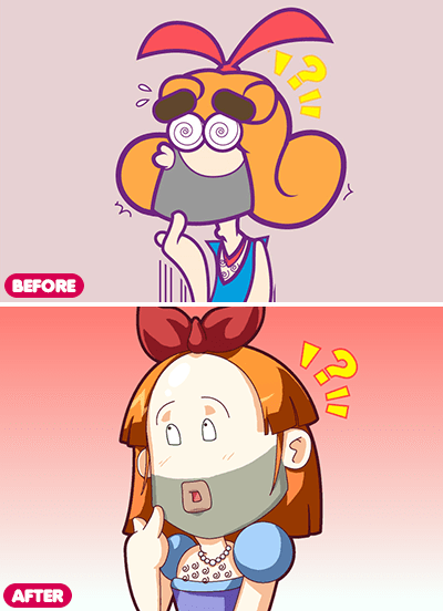
 Friday 4Koma #1 — Panel 2 (before & after)
Friday 4Koma
When I originally began Friday 4Koma, it was meant to only be the filler content between episodes of Omake Theater's animated shorts. Over ten years later, that is not how things panned out.
The art direction for Friday 4Koma was originally influenced (pretty heavily) by the playable characters that appeared in the Puyo Puyo series by Compile/Sega. On November 20, 2009, the website launched and Friday 4Koma began its life with this initial artistic style. Five days later, on November 25th, the comic was updated to reflect the new art direction it kept until the very end. You can still find the original version of the first comic online, as I wound up using it as an actual update for the series.
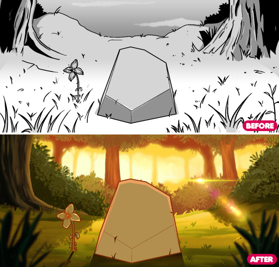
 In Another World as a Rock #3 — Panel 2 (before & after)
In Another World as a Rock…
In Another World as a Rock was originally done grayscale when it first launched. I was going for a simpler art direction that would be cheaper to collect and print as comic/manga down the road. Unfortunately, I was not happy with how the series looked. So, after completing the first 12 pages, I put the comic on hold and updated all the artwork to reflect a more animated feel, as well as fix glaring mistakes I had made during my first go around.
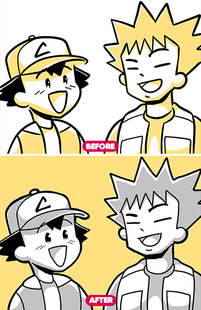
 Yōikoma #1 — Panel 1 (before & after)
Yōikoma
Unlike the other series, Yōikoma never launched with its original art direction. Why? Because one day before I released the original teaser image (which became the very first Mini-Yōikoma), I changed it.
In all honesty, I probably could have lived with that art style. There was just something that felt off about using it. I still kept the same rules of using only five colors, though. The colors are black, white, gray, additional color (either yellow, red, green, blue or purple) and a darker version of this additional color. No orange. Why? Well, I think we all know why.
There you go!
I love sharing and discussing all the minutiae and behind-the-scenes details about what goes into creating content for the web. In fact, Omake Theater's Patreon is pretty much a collection of all the sketches and artwork before the comics are completed. If you're into stuff like that, head on over there and check it out. It only costs $1 for full access to the Patreon posts.
As always, thank you for your support and I hope you enjoyed this brief trip down memory lane.